Floral wallpaper is having a serious moment.
From the grandmillennial revival that has brought cherished, layered interiors back into the spotlight, to the rise of maximalist design on social media, florals are everywhere right now and for good reason.
They bring warmth, personality, and a sense of considered style that plain painted walls simply cannot match.
The best part is that floral wallpaper works across a huge range of aesthetics.
Whether you lean toward classic and romantic or bold and graphic, there is a floral design that fits your home.
The real skill is in knowing how to use it well so the result looks intentional rather than accidental.
Here are seven practical ways to style floral wallpaper in a way that feels fresh, confident, and completely at home in a modern interior.
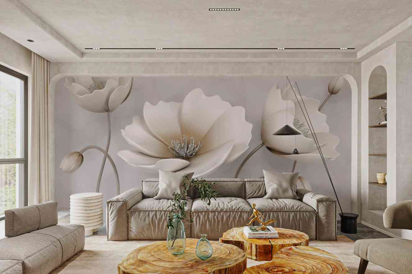
Commit to one statement wall
The biggest mistake people make with floral wallpaper is going too small or too cautious.
A single accent wall done boldly will always outperform four timid walls.
Choose the wall that your eye naturally lands on when you enter the room, typically the one directly opposite the door, and commit to it fully.
A large-scale floral print on one wall creates a focal point that anchors the entire room without overwhelming it.
Keep the remaining three walls in a neutral tone pulled from the wallpaper’s palette and let that one wall do all the talking.
Pair it with clean, simple furniture
Floral wallpaper works best when the furniture around it plays it straight.
If your walls are making a statement, your sofa, coffee table, and shelving should stay calm.
Think clean lines, solid upholstery in neutral tones, and minimal ornamentation.
Mid-century modern furniture is a particularly strong pairing because its simplicity creates contrast rather than competition. The wallpaper becomes art; the furniture becomes the frame.
Use it in unexpected rooms
Living rooms and bedrooms get most of the attention, but floral wallpaper performs exceptionally well in smaller, more functional spaces.
A powder room with floor-to-ceiling florals feels dramatic and intentional in a way that a large room simply can’t replicate.
Hallways, laundry rooms, and home offices are all underrated canvases. Because these spaces are smaller, you use less material and the impact per square foot is significantly higher.
Guests notice it immediately, and the confined space makes even a bold pattern feel contained rather than chaotic.
Choose the right scale for your room
Scale is the detail that separates a well-designed room from one that feels off without anyone knowing exactly why.
Large-scale floral prints work well in spacious rooms with high ceilings where the pattern has room to breathe.
In smaller rooms, oversized prints can actually make a space feel larger by drawing the eye upward and outward, but only if the colors are relatively light.
Small, dense floral patterns in dark rooms tend to close a space in. If you’re working with limited square footage, look for designs that have generous negative space between the motifs.
That breathing room is what keeps the pattern from feeling claustrophobic.
If you want something versatile that works across room sizes and lighting conditions, the floral wallpaper collection at Think Noir covers a wide range of scales and motif styles, from delicate watercolor botanicals to bold graphic prints, so you can match the design to the room rather than forcing a pattern to fit.
Mix florals with geometric or textured elements
One of the most effective modern styling tricks is mixing pattern types deliberately.
Floral wallpaper paired with a geometric rug or textured linen cushions creates visual interest without chaos, as long as you keep the color palette consistent.
The key word there is deliberately. Choose one dominant pattern, in this case the wallpaper, and let everything else either complement or contrast it in texture rather than competing in pattern.
A jute rug, a woven throw, a matte ceramic lamp base: these elements add depth without noise.
Get the color balance right
When selecting floral wallpaper, pay attention to the background color as much as the floral motif itself.
A dark background, think deep navy, forest green, or charcoal, gives florals a moody, sophisticated feel that reads as very current in interior design right now.
A light or white background keeps things airy and fresh. Either works, but they create entirely different atmospheres.
The important thing is to decide on the mood of the room first, then choose your wallpaper to support it rather than the other way around.
Don’t match. Coordinate.
A common instinct is to match the wallpaper’s colors exactly to your soft furnishings.
Resist it. Exact matching makes a room feel flat and over-coordinated, like a hotel lobby rather than a home.
Instead, pull one or two colors from the wallpaper and echo them loosely in cushions, artwork, or a single piece of furniture.
Let there be some tension between the elements. That slight imperfection is what makes a room feel curated by a person rather than assembled from a catalog.
The Bigger Picture
Floral wallpaper in a modern home isn’t about nostalgia. It’s about confidence.
The rooms that pull it off best are the ones where a clear decision was made and then fully committed to.
No second-guessing, no hedging with overly safe furniture choices, no toning it down until the pattern loses its point.
Start with one wall. Get the scale right for your space. Choose a background color that sets the mood you’re after.
Keep the furniture clean and let the pattern lead. When you approach floral wallpaper with that kind of intention, the result doesn’t just look good.
It feels like the room was always meant to look that way.
The best interiors are rarely the ones that played it safe. They’re the ones where someone made a bold call and followed through.
Floral wallpaper, done right, is exactly that kind of call.


